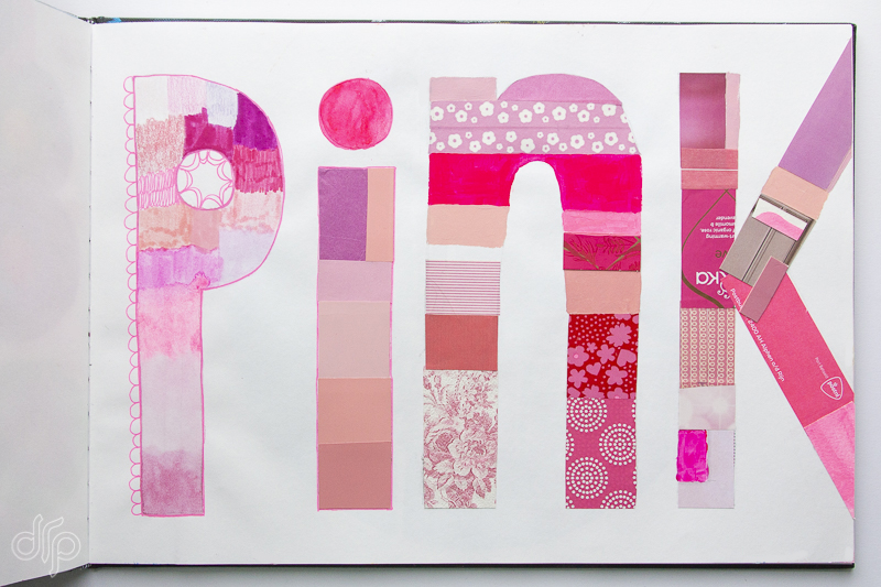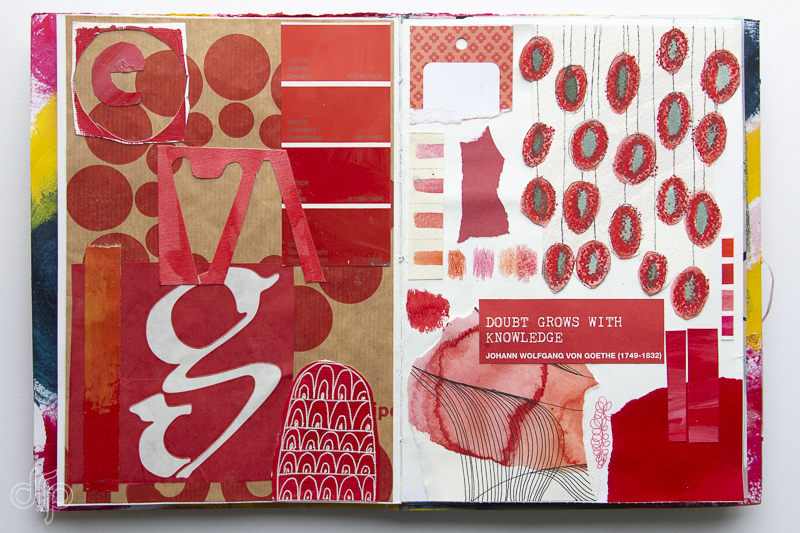
During the last couple of months I participated in the K.I.S.S. (Keep it Simple Sweetheart) Challenge organized by Kellee Wynn Studios, the artist behind Color Crush Creative. The challenge was about creating simple pieces with a simple palette: one colour. This challenge was not about making masterpieces but to explore a simple colour palette.
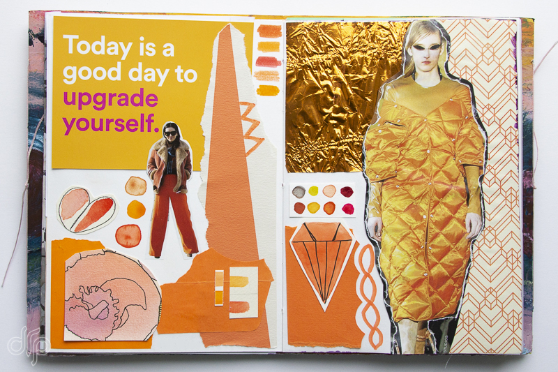
I loved the idea of making something simple featuring one colour and collage seemed the best way to achieve. In this way I could also use up loads of my collage fodder that I’ve gathered over the years. Adding watercolors, markers, felt pens or crayons made them more like mixed media collages.
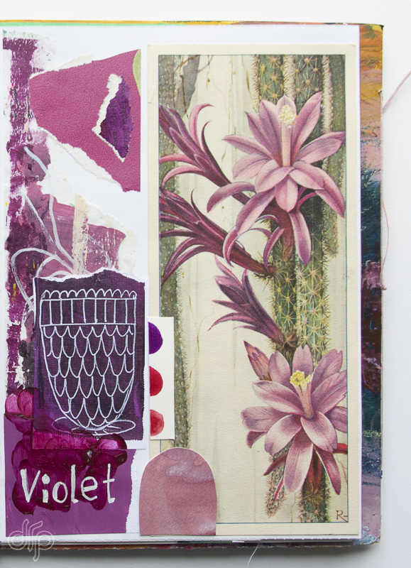
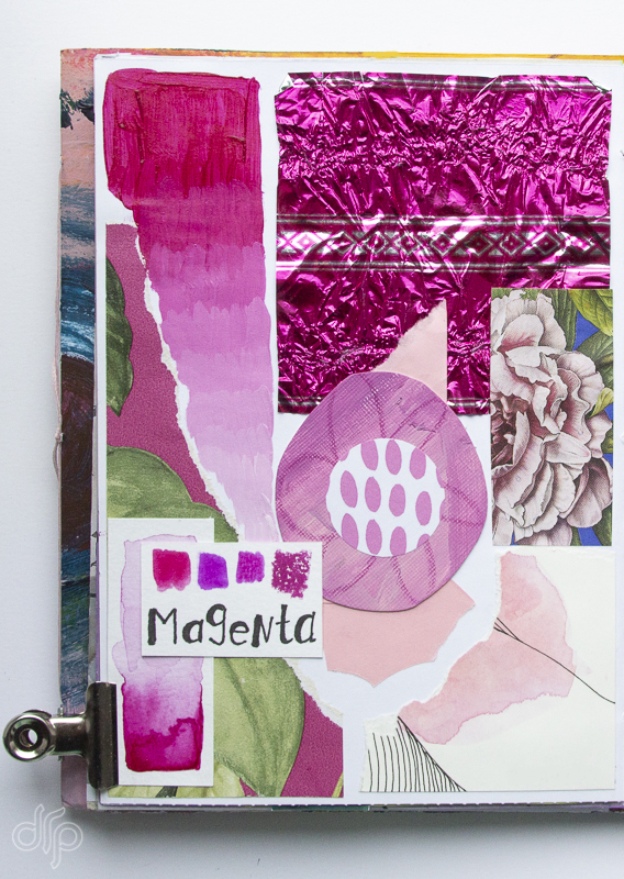
But since English is not my native language I noticed that I couldn’t ‘feel’ the meaning of some words, for instance I couldn’t feel what Violet and Magenta looked like. Yellow, red and blue are easy to comprehend, but the other two are not. So by using paints or other supplies that were called violet or magenta and collecting pieces of coloured paper that matched them, the definition of those colours grew on me.
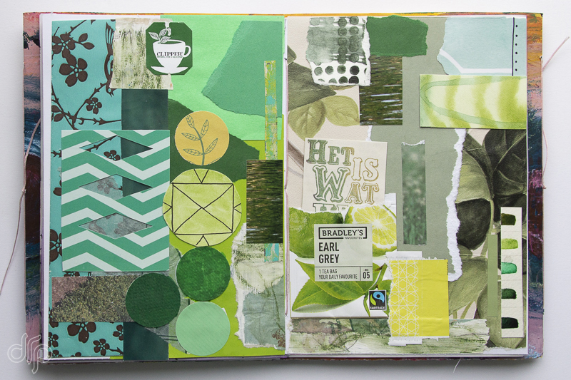
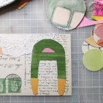
In the green spread I even used a tea sachet as a pocket and tucked in a quote from Flow Magazine: “It is what it is.”
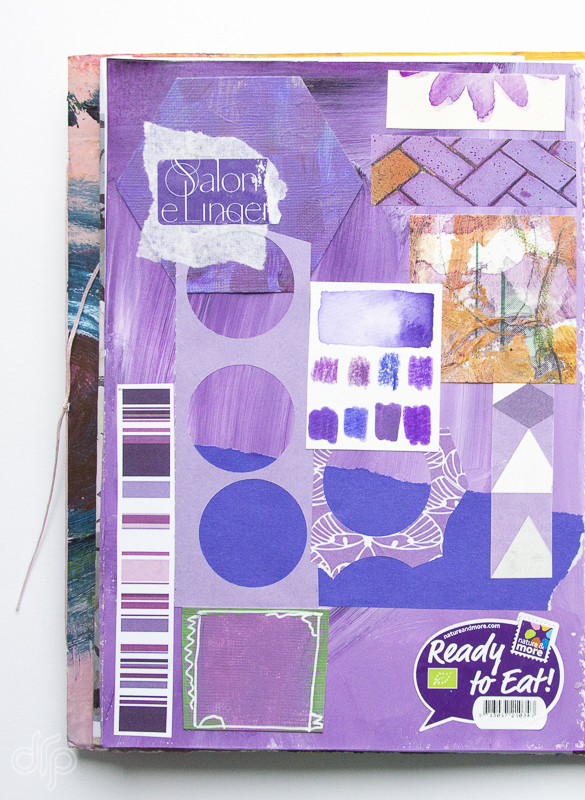
Purple wasn’t part of the challenge, but I made it to understand the difference between violet, magenta and purple better.
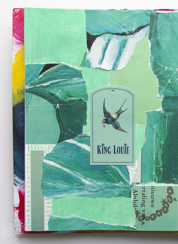
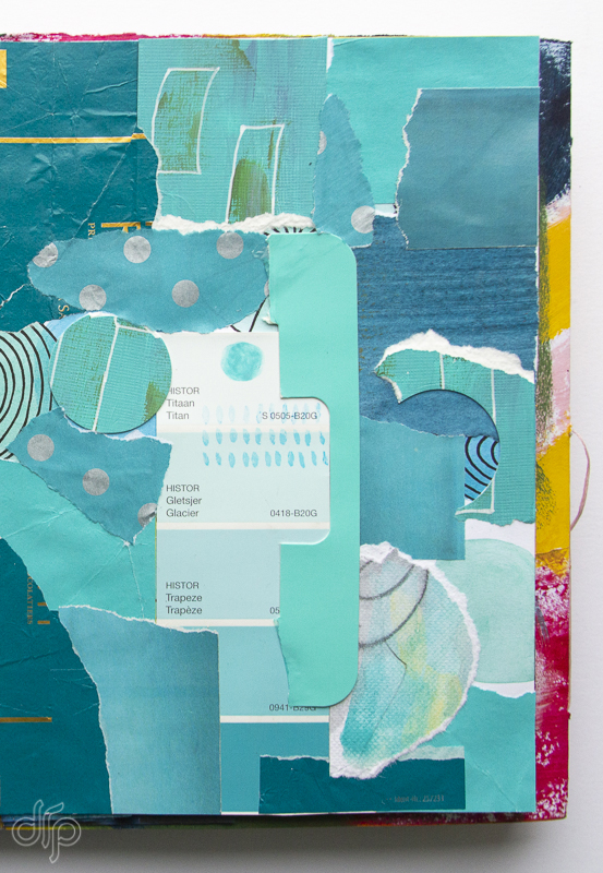
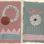
Emerald and Teal weren’t part of the Crush Challenge either, I made them because I simply love those colors and I noticed how close to one another they are. Part of the process for me was deciding which tone belonged to emerald and which to teal. Emerald is going more towards green and teal towards blue, but sometimes it was a close call.
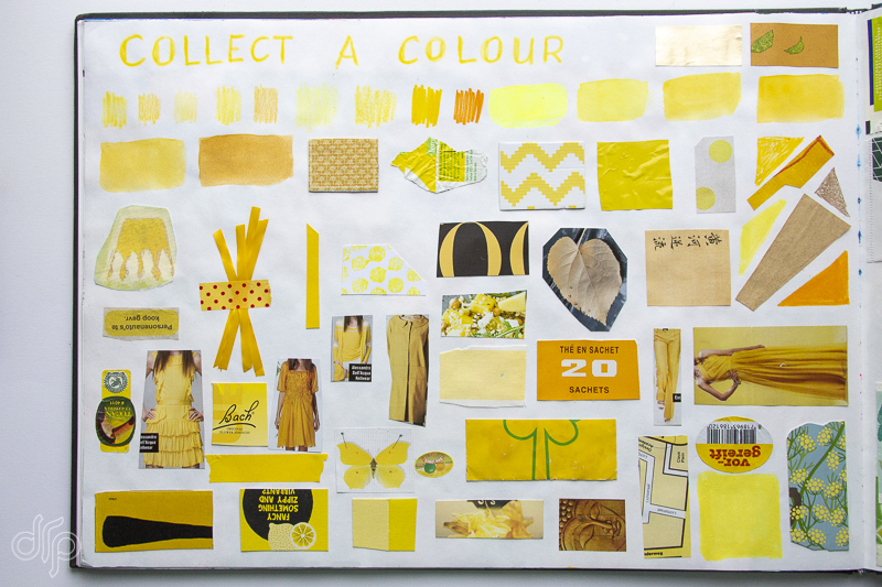
The Color Crush Creative Challenge reminded me a lot of the lesson ‘Collect a color’ from the class ‘Living a more creative life: 30 ways 30 days‘ by Courtney Cerruti of Creativebug which I took in the Fall of 2017. To her “it’s super visually satisfying playing with a certain colour. You can use any medium and it’s a fun way to play with all of your art supplies without having the pressure to draw anything specific. I’m not making perfect shapes, I’m just laying stuff down.”
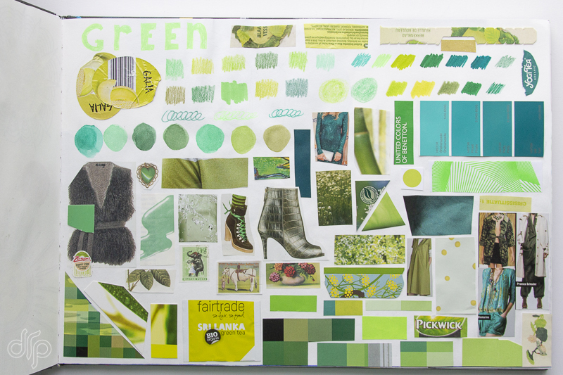
And I totally agree with her: you’re making anything specific, it doesn’t have to be beautiful, it’s just a kind of an overview. It’s like colour swatching with your art supplies and collage pieces. Courtney did it in a grid fashion, but I made a few other ones as well such as a shape (circle) and the word of the colour itself.
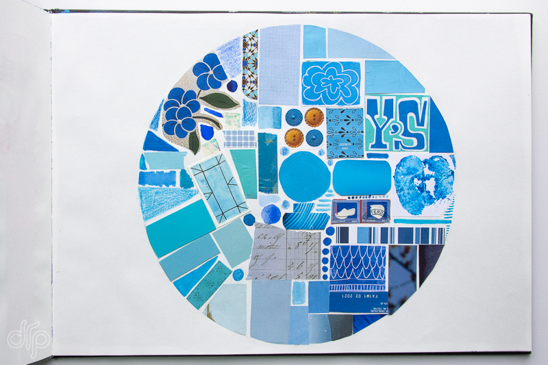
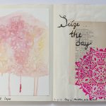
The spreads I made this year are not made in a grid fashion, I just laid down scraps of paper in a manner that felt good to me. Making collages in this way trains you eye in composition.
